| This site requires new users to accept that a small amount of member data is captured and held in an attempt to reduce spammers and to manage users. This site also uses cookies to ensure ease of use. In order to comply with new DPR regulations you are required to agree/disagree with this process. If you do not agree then please email the Admins using info@nikondslr.uk after requesting a new account. Thank you. |
| Moderated by: chrisbet, | ||
| Author | Post | |||||||||
|---|---|---|---|---|---|---|---|---|---|---|
Robert
|
But... Not overwhelmed with the results. More to do with the processing than the subject or the photography. No good blaming the gear. It's some time since I took (and processed) any IR photographs. The images straight from the D200 are much nearer than from my old D1, which took a lot of coaxing to life. However, having spent most of the day processing them I just walked away. Not bad but not what I visualised. D200, 18-105mm f/3.5-5.6 VR. Processed in Lightroom and Photoshop with red-green channels swapped by the photoshop built in process, which I have slightly customised to give 3% red to warm the otherwise stark white/grey image. Most of the images are HDR from between three and five exposures depending on the wind/tree movement and the exposure range. Here are a couple of examples: 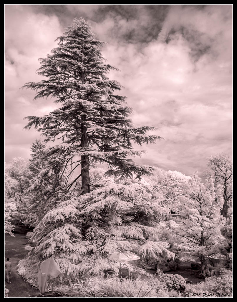 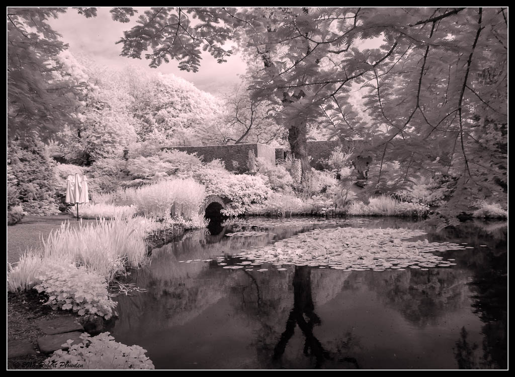 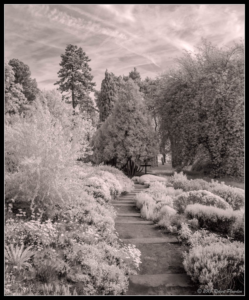 I would have preferred an ivory off white rather than pink hue. |
|||||||||
Eric

|
I prefer the last shot because the path leads you into the foliage. As you know I am a great believer in the necessity for strong elements in an IR image that are not responsive to IR. The path is a good example. I might have gone further and increased the paths dominance by selectively colouring it. The easiest way with IR is to take an untouched brown copy and place it on a layer over the image. Then erase everything except the path. You get a brown path amounts the white. I would also do a gradient darkening on the sky ....to better frame the top edge. |
|||||||||
Robert
|
Thank you Eric!  Will try that... |
|||||||||
Eric
|
Something like this.. Attachment: 86A0CC8B-45B3-4BBA-8613-4B6086A1057B.jpeg (Downloaded 21 times) |
|||||||||
Eric
|
As we have discussed before, there can be a sameness about IR images that make it harder and harder to motivate oneself to get out and look for the unusual. Witness the fact that image of mine is 8 years old! And I haven't been inspired to do any in 18months or more! However with a holiday on the horizon, you have reminded me I do need to take my Fuji IR with me...and batteries!!! Like a lot of occasions in photography, you don't see images unless you are looking...so maybe I need to look harder!! Thanks for reminding me! |
|||||||||
Robert
|
Something like this?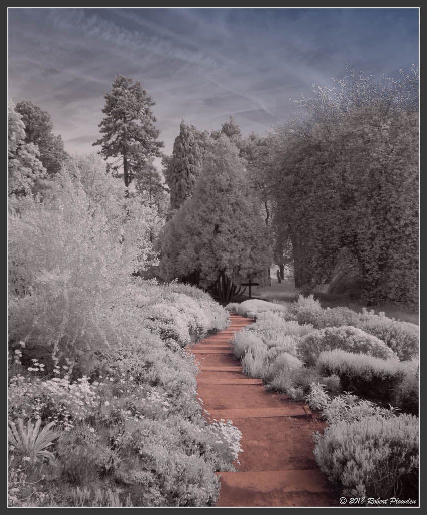 Masking the sky wasn't easy... A lot of hand retouching. Maybe I shouldn't have allowed the blue to fade away completely on the left... |
|||||||||
Eric
|
Robert wrote:Something like this? What do YOU think? Better or not? |
|||||||||
Eric
|
Apart from the path and sky, I personally like to have more contrast in the mid tones. So without blowing the highlights or flattening the shadows Ove just boosted mid tone contrast on this copy by 20%. Attachment: A1DE1426-A6A6-4D1F-9A76-D1930D595928.jpeg (Downloaded 21 times) |
|||||||||
Robert
|
Eric wrote:What do YOU think? Better or not? Better but not there yet. Not 100% happy with the sky or the sky masking of the twiglets to the right. The image lacks impact and 'sparkle'. Yet, I felt it was potentially a nice candidate. A cloudless sky would have been easier. |
|||||||||
Robert
|
Eric wrote:Apart from the path and sky, I personally like to have more contrast in the mid tones. So without blowing the highlights or flattening the shadows I've just boosted mid tone contrast on this copy by 20%. Much better, I had the blacks and whites pretty 'right'. You are correct, the mid tones benefit from more contrast. I have addressed the overall tone of the image but still it lacks the ivory, pale cream tone that I wanted. More work required... It's one thing taking these photographs, the work is in the processing and I haven't used this aspect of Ps for a long time. This was what I loved about Bibble, you could adjust the tones so easily and subtly it was a joy to use, combined with the zone selection like the NIK filter software has it was a doddle to use. In fact I might just try the NIK filters on this... Later, have concrete to mix right now. |
|||||||||
Eric
|
Use the Plowden adjustment technique but double click the white dropper and reset the white point to the cream colour you want.  |
|||||||||
Robert
|
I couldn't get that to work but by selecting the layer and opening Hue-Saturation I was able to adjust the tones to my hears content. Not sure it's right but it's definitely better than it was. The sky seems to have a mind of it's own... I also adjusted the hue, saturation and brightness of the path, for better or worse I don't know! Thank you Eric for getting me on the right path. 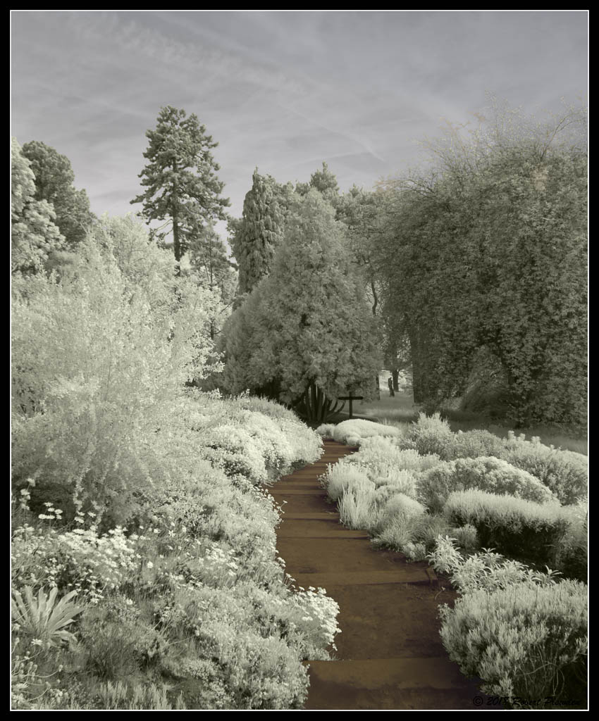 EDIT: This morning I revisited this image, I wasn't happy with it, I was getting tired yesterday. This is my re-work this morning. IMO much better, although I just noticed I seem to have de-focused the tree tops... Doh! 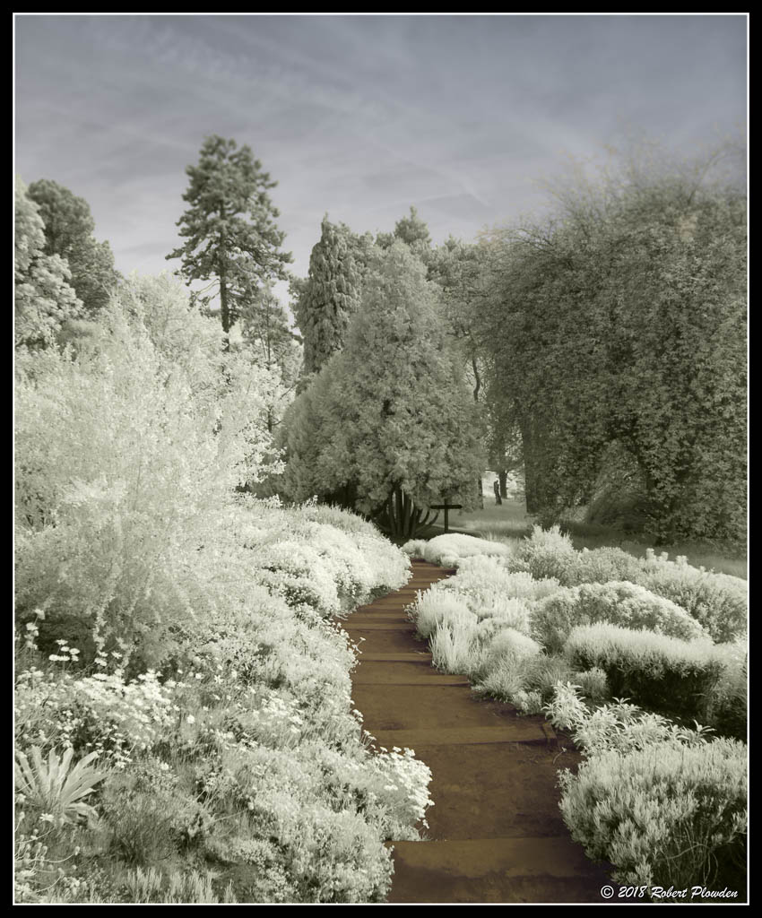 |
|||||||||
Robert
|
OK, so maybe got that one sorted... On the basis of having a prominent item in the scene, I have selected four more pictures which I think might be worthwhile. Aside from the processing, which I will re-work, what do you think of the potential of these. #407  #428 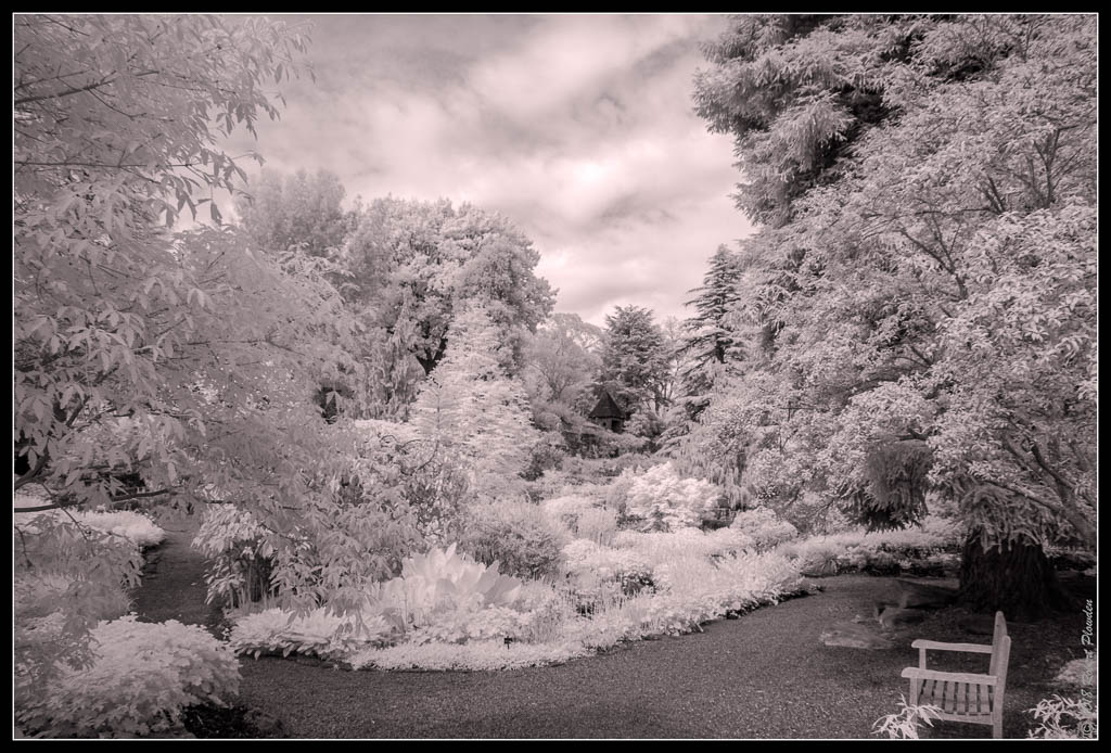 #441 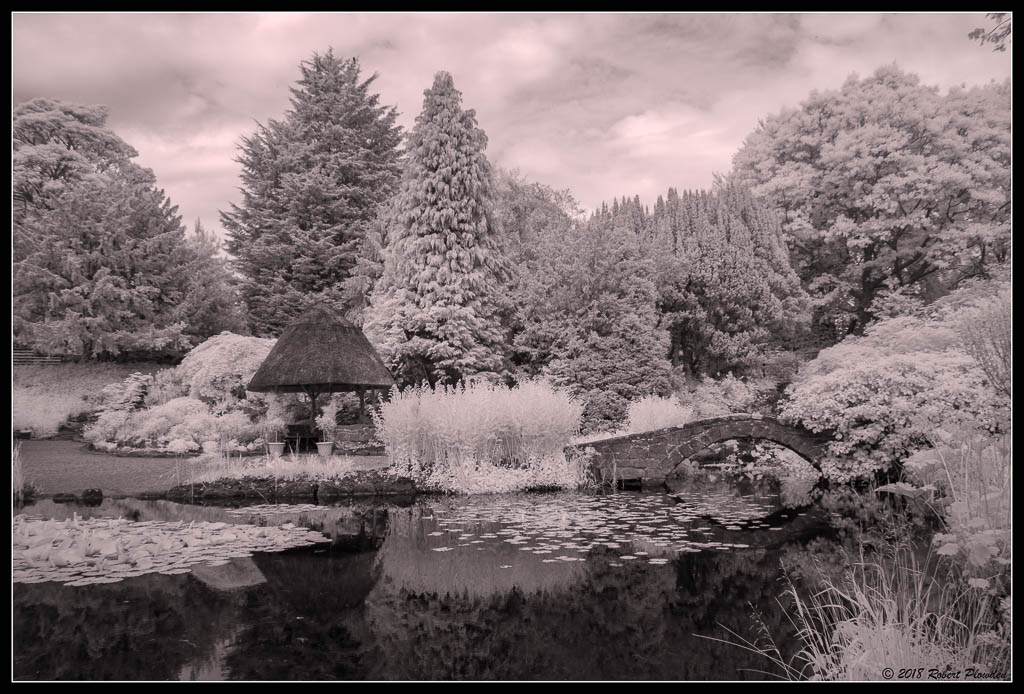 #487 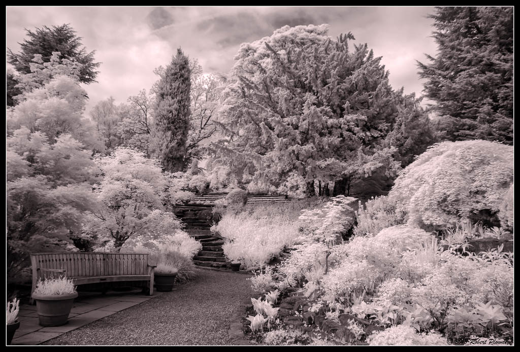 |
|||||||||
Eric
|
Some nice shots there Robert...last two my favourites. With regard to the original image we were discussing....I still feel there is a lack of contrast in the mid tones. And my feeling the colour is too green yellow. I know it's persoanla tast. I've tweaked it ... Attachment: FD17C192-6F58-4E75-BB85-9EA2441524C6.jpeg (Downloaded 14 times) |
|||||||||
Eric
|
With regard to today's shots...again I think they are too pink? I prefer a sepia look if not true white... Attachment: 01CBCE30-937D-4761-ACD3-744106BFC500.jpeg (Downloaded 15 times) |
|||||||||
Eric
|
This one too.... Attachment: 702BB59A-F2F8-450E-B1EB-2C41496BD01A.jpeg (Downloaded 14 times) |
|||||||||
Eric
|
Like I said...you've got my juices flowing again. Have packed IR camera for holiday next month. |
|||||||||
jk
|
Agree with Eric. Need to reduce the pink in the image. For me I prefer BnW with blue skies. The red path is interesting though! |
|||||||||
Robert
|
Yes, I realised the pink was silly, I find adjusting tones hard in Ps, I always have, that was why I used Bibble for IR. Thanks for the adjustments Eric, I will try to emulate that feel in the remaining images. I think the last one 'works' best for me but I also think the bridge is a tremendous opportunity, it's just getting it right, angle and perspective. I have a similar shot of the bride taken with the 16mm fisheye and although it gives a much wider view, I don't feel it's as good as the 18mm zoom. |
|||||||||
Eric
|
The bridge would be better at slight angle rather than straight on. But a good set of images with lots of potential. |
|||||||||
Robert
|
Eric wrote:The bridge would be better at slight angle rather than straight on. They are all with sets of five, bracketed in 1/3 stop increments. The views of the bridge are limited by the trees around the pond. It's either straight on, 60º or 80-90º Slightly off straight will result in soggy feet! It's such a photogenic place it's hard not to get some nice pix. There are a very wide range of plants and trees, all seasons produce a wide array of plants to photograph. At least you don't need a 1000mm lens! Maybe a wide macro? |
|||||||||
Eric
|
Robert wrote:Eric wrote: Or a torch!  |
|||||||||
Robert
|
Eric wrote:Or a torch! Now there's an idea... |
|||||||||
Eric
|
Robert, just going back to my post 11 and your reply 12.... Ive gone through the process of resetting white point colour in stages below in case you ever want to try it. It essentially enables you to change the colour of what Photoshop sees as 'pure white'. Ive taken this fieldfare image and masked right half so you can see difference... 1.Open Levels (or curves) Attachment: stage1.jpg (Downloaded 17 times) |
|||||||||
Eric
|
2. DOUBLE CLICK on the white eyedropper to reveal the colour menu. 3. Select a new colour...Ive used 5% yellow as an example Attachment: stage2.jpg (Downloaded 17 times) |
|||||||||
Eric
|
4. Click OK and you return to the Levels menu 5. Make sure the white eyedropper is highlighted and move the eye dropper over the image to an agrea you want to be the max 'yellowy white' and touch it. You may need to move it around to find the max highlight spot, or to get the right tint. 6. Hit OK Attachment: stage3.jpg (Downloaded 17 times) |
|||||||||
Eric
|
You will then be presented with a request whether this is a permanent change in white colour. Say NO....unless you always want yellowy whites.  Attachment: stage5.jpg (Downloaded 16 times) |
|||||||||
Robert
|
Eric wrote:Robert, just going back to my post 11 and your reply 12.... Eric, many thanks for taking the trouble to document the detail, I think I did miss a step or two. Have been busy today, bit tired, will check it out later when I get over the day's heat. |
|||||||||
hj
|
Truly amazing, love the infrared. |
|||||||||
Robert
|
Thank you hj, I really enjoy IR but I find the processing tedious. I don't have a clear routine for processing IR and find masking the sky a fiddly, time consuming task, despite all the clever masking tools in Ps. Given that most IR images have trees and skies which regularly impose on each other, the masking can be quite difficult, for me anyway. That is the main reason I use my superb D200IR so infrequently. That's also the reason I keep well clear of video. For me five minuets of video equals at least five days at the computer trying to edit the clips (badly). I used to have a nice Sony HandyCam took some nice clips of the children when they were growing up but the video files languish on a backup hard drive which is seldom even hooked up to the computer.  I now have a nice tiny cubic GoPro which produces superb video but I still can't face the editing of the clips. So it rarely gets an outing. |
|||||||||
Current theme is Blue
| A small amount of member data is captured and held in an attempt to reduce spammers and to manage users. This site also uses cookies to ensure ease of use. In order to comply with new DPR regulations you are required to agree/disagree with this process. If you do not agree then please email the Admins using info@nikondsl.uk Thank you. |